
Using a Continous Wavelet Transform for Classification
To see why we use Continous Wavelt Transforms to classify signals we'll take a look at signals from a stoplight. The idea is we want to be able to identify if a stoplight is properly functioning.
import matplotlib.pyplot as plt
import numpy as np
import plotly.express as px
import pandas as pd
import fcwt
from scipy.signal import stft, get_window
Create a dummy Stoplight signal. Like a stop light the red, green and yellow parts of the signal have different Frequencies. First green for five seconds then yellow for two and finally red.
# Define parameters
duration = 10  # Duration of the signal in seconds
sampling_rate = 1000  # Sampling rate in Hz

# Generate time vector
t = np.linspace(0, duration, int(duration * sampling_rate), endpoint=False)

# Generate signal with varying frequencies
signal = np.sin(2 * np.pi * 3 * t) * (t <= 5) + np.sin(2 * np.pi * 5 * t) * ((t > 5) & (t<=7)) + np.sin(2 * np.pi * 1 * t) * (t > 7)

# Plot the signal
df = pd.DataFrame({'Time': t, 'Amplitude': signal})

# Plot the signal using Plotly Express
fig = px.line(df, x='Time', y='Amplitude', title='Non Static signal',
              labels={'Amplitude': 'Amplitude', 'Time': 'Time (s)'})
fig.add_trace(px.line(df.iloc[:5000,:], x='Time', y='Amplitude', color_discrete_sequence=['green']).data[0])
fig.add_trace(px.line(df.iloc[5000:7000,:], x='Time', y='Amplitude', color_discrete_sequence=['yellow']).data[0])
fig.add_trace(px.line(df.iloc[7000:10000,:], x='Time', y='Amplitude', color_discrete_sequence=['red']).data[0])
fig.update_layout(xaxis=dict(title='Time (s)', range=[0,10]), yaxis=dict(title='Amplitude'))
fig.show()
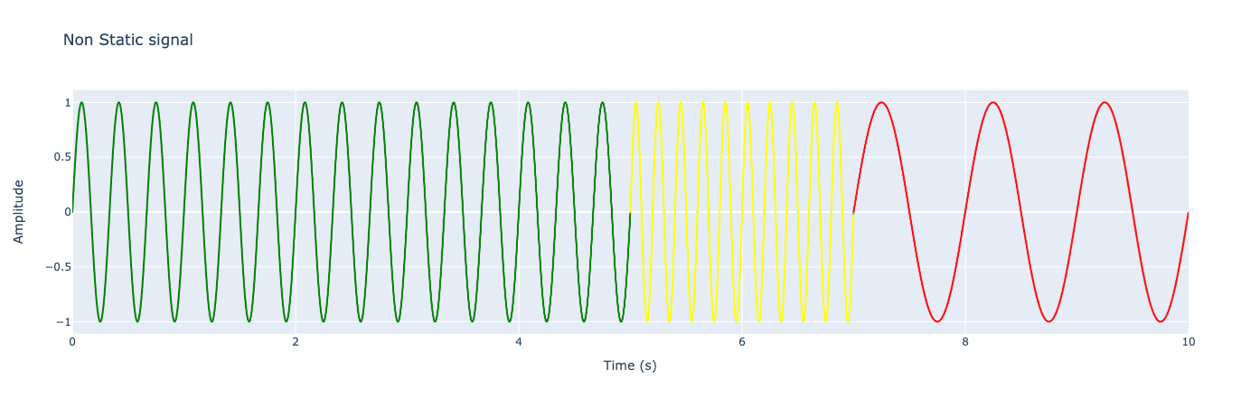
By Fourier transforming the signal we can see the different frequencies that make up our signal. The peaks at one, three and five, represent red green and yellow respectivly. The smaller ripples between the peaks are caused by the sudden change in frequencey.
fft_result = np.fft.fft(signal)
frequencies = np.fft.fftfreq(len(signal), 1/sampling_rate)  # Compute the frequencies

fourrier_df = pd.DataFrame({'Frequency': frequencies[:len(frequencies)//2],
                                     'Magnitude': np.abs(fft_result)[:len(frequencies)//2]})

fig = px.line(fourrier_df, x="Frequency", y='Magnitude', title="Fourier Transformed Stoplight")
fig.update_layout(xaxis=dict(title='Frequency (Hz)', range=[0, 8]), yaxis=dict(title='Magnitude'))
fig.show()

Now we'll create a broken stoplight signal. Here we still have a green light for 5 seconds but the the red and yellow start at the same time. This gives us blue wavy signal for two seconds, then red for a second, and no lights are on for the last 2 seconds of the 10 second light cycle.
#make time shorter
t = np.linspace(0, duration, int(duration* sampling_rate), endpoint=False)

#generate a broken singal
broken_signal = np.sin(2 * np.pi * 3 * t) * (t <= 5) + np.sin(2 * np.pi * 5 * t) * ((t > 5) & (t<=7)) + np.sin(2 * np.pi * 1 * t) * ((t > 5) & (t<=8))

broken_signal_df = pd.DataFrame({'Time': t, 'Amplitude': broken_signal})


# Plot the signal using Plotly Express
fig = px.line(broken_signal_df.iloc[0:1,:], x='Time', y='Amplitude', title='Broken Non Static signal',
              labels={'Amplitude': 'Amplitude', 'Time': 'Time (s)'})
fig.add_trace(px.line(broken_signal_df.iloc[:5000,:], x='Time', y='Amplitude', color_discrete_sequence=['green']).data[0])
fig.add_trace(px.line(broken_signal_df.iloc[5000:7000,:], x='Time', y='Amplitude', color_discrete_sequence=['blue']).data[0])
fig.add_trace(px.line(broken_signal_df.iloc[7000:8000,:], x='Time', y='Amplitude', color_discrete_sequence=['red']).data[0], )
fig.update_layout(xaxis=dict(title='Time (s)', range=[0,10]), yaxis=dict(title='Amplitude'))
fig.show()

Now here you might want to look for a bug in the code, our fourier transform is exactly the same. Welp it's not a bug it's a feature of the fourier transform. The fourier transform gives us lots of info about the frequencies in our signal but we lose any information about the time. The three different frequencies still make up the same percentage of the entire signal. Resulting in an identical fourier transform no matter what time the signals start at.
broken_fft_result = np.fft.fft(broken_signal)
broken_frequencies = np.fft.fftfreq(len(broken_signal), 1/sampling_rate)  # Compute the frequencies

broken_fourrier_df = pd.DataFrame({'Frequency': broken_frequencies[:len(broken_frequencies)//2],
                                     'Magnitude': np.abs(broken_fft_result)[:len(broken_frequencies)//2]})

fig = px.line(broken_fourrier_df, x="Frequency", y='Magnitude', title="Fourier Transform of Broken Stoplight")
fig.update_layout(xaxis=dict(title='Frequency (Hz)', range=[0, 8]), yaxis=dict(title='Magnitude'))
fig.show()

Short Time Fourier Transform to the Rescue
Well almost, in the example directly below we can see the STFT works for our problem. In that we can see at what time the different frequencies happen. This means we can identify when a signal is broken if we know what the STFT of a working signal looks like.
samples_per_window = 1000

window = get_window("hann", samples_per_window)

f, t, Zxx = stft(signal, sampling_rate, nperseg=samples_per_window, window = window)
plt.pcolormesh(t, f[:10], np.abs(Zxx[:10,:]), shading='gouraud')

plt.title('STFT Magnitude')
plt.ylabel('Frequency [Hz]')
plt.xlabel('Time [sec]')
plt.show()

The Drawbacks
Here we have adjusted our window size to be larger which gives us better frequencey resolution . You can see that the blobs no longer have a region where they overlap at 2hz as in the previous graph. The problem with this is that we then lose time resolution. Our window size is 3000 ms or three seconds. This is a problem since our yellow light signal only happen for 2 seconds so we complely lose sight of it with our 3 second window size.
samples_per_window =3000


window = get_window("hann", samples_per_window)

f, t, Zxx = stft(signal, sampling_rate, nperseg=samples_per_window, window = window)
plt.pcolormesh(t, f[:10], np.abs(Zxx[:10,:]), shading='gouraud')

plt.title('STFT Magnitude')
plt.ylabel('Frequency [Hz]')
plt.xlabel('Time [sec]')
plt.show()

The Drawbacks in Reverse
Here we have the exact oposite problem as before. With a window size of 100 miliseconds we have excelent time resolution but suffer with frequency resolution. You can see that all the frequencies span from zero to twenty and you can't pinpoint at around what frequency the blobs are centered at.
samples_per_window =100


window = get_window("hann", samples_per_window)

f, t, Zxx = stft(signal, sampling_rate, nperseg=samples_per_window, window = window)
plt.pcolormesh(t, f[:10], np.abs(Zxx[:10,:]), shading='gouraud')

plt.title('STFT Magnitude')
plt.ylabel('Frequency [Hz]')
plt.xlabel('Time [sec]')
plt.show()

The Ultimate Solution
Introducing the cwt. With the cwt we get the best of both worlds by taking a wavelet transforms with different wavelet sizes. Towards the top of the transform we use small wavelets to pick up high frequencies that only occur for a short time. Since the wavelt is small we have good time resolution but lose some frequencey precision. Towards the bottom of the transform we use a larger wavelet which is why the blobs are more stretched across time. Our time resolution is worse but the frequency resolution is better.
f0 = 0.1 #lowest frequency
f1 = 5 #highest frequency
fn = 300 #number of frequencies

#plot cwt
fcwt.plot(broken_signal, sampling_rate, f0=f0, f1=f1, fn=fn)

f0 = 0.1 #lowest frequency
f1 = 5 #highest frequency
fn = 300 #number of frequencies

#plot cwt
fcwt.plot(signal, sampling_rate, f0=f0, f1=f1, fn=fn)
